Booking the right doctor in a few clear taps.
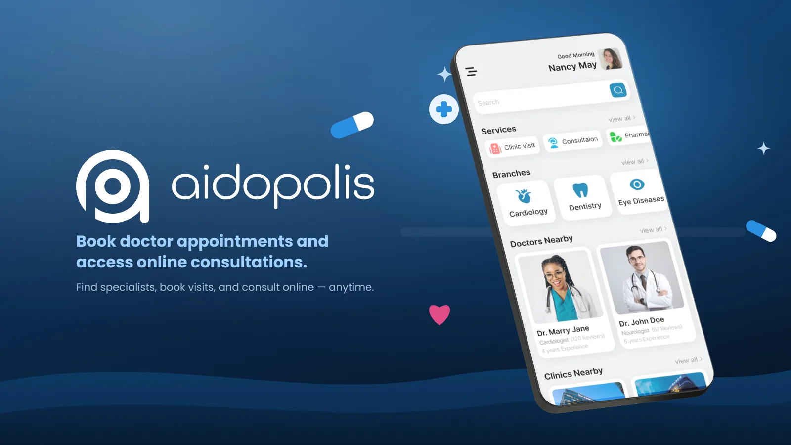
Aidopolis is a platform that lets users easily book appointments with doctors and clinics while accessing online consultation services. It improves patient–doctor communication, provides transparent information, and simplifies access to healthcare.
Users face time loss, difficulty finding the right doctor, and complex appointment processes when accessing healthcare — which keeps them from fast, reliable medical care.
When the decision is your health, every unclear step costs trust.
Reduce appointment booking time by 40%
Provide reliable information on doctor profiles
Shorten payment & confirmation to under 3 clicks
Ensure smooth online video consultations
A 120-person survey, twelve in-depth interviews and healthcare reference walkthroughs.
Synthesizing findings into clear problems, user goals, flows, and the information architecture.
Wireframes to high-fidelity UI, built on a component system and refined through iteration.
Prototype flows and interface specifications, with validation priorities identified for the next stage.
Individuals aged 18–45 with busy lifestyles seeking quick healthcare access.
Chronic patients needing regular check-ups, and people booking for family members.
Method Online survey · 120 respondents, 12 in-depth interviews, competitor walkthroughs · ages 18–55
| Task / dimension | Zocdoc (US) | Amwell (US) | Aidopolis |
|---|---|---|---|
| Find care | Provider search and patient reviews | Telehealth care access | Doctor profiles, ratings and specialty discovery |
| Video consultation | Video-visit booking and joining | Video care services | Proposed integrated video visit |
| Appointment continuity | Appointment details and reminders | Scheduling within telehealth services | Calendar, reminders and visit history |
| Payment context | Provider and insurance dependent | Service and coverage dependent | Proposed clinic and card payment choices |
| Design focus | Provider discovery and booking | Remote care delivery | Booking, consultation and follow-up journey |
Reference comparison updated September 2026. Rows describe task coverage and design focus, not a usability ranking. Availability may vary by plan, region and product version; the final column describes this case study’s design. US services are international pattern references for the London-based persona, not evidence of UK availability or compliance. Deployment requires local provider, payment and privacy requirements.
Specialties are explained in plain words — what they cover, how many doctors, starting price — so people who don't know the right specialty still find the right door.
Rating, years of experience, patient count, qualifications and verified patient quotes sit above the fold, with a fixed Book CTA.
Time → Details → Confirm, with the consultation type (video, chat, in clinic), calendar and slots on one screen.
Medications, records, notifications and the video visit itself live in the same app, so the appointment doesn't end at confirmation.
survey respondents · ages 18–55
Reported interest in reviews and price transparency informed a doctor card that brings experience, rating and price together. A statistically significant increase in booking continuation is not established by the survey figures shown here.
Long, complicated appointment booking flow
Lack of trust in the doctor information shown
Limited payment options
Connectivity issues in online consultations

Sophie is a busy professional who spends most of her day in meetings and managing projects. She often postpones minor health issues until they become serious. After the pandemic she discovered online healthcare and now prefers digital solutions that save time.
| Stage 01Search Find care | Stage 02Choose Doctor profile | Stage 03Book Time & details | Stage 04Confirm Pay & confirm | Stage 05Visit Video consultation | |
|---|---|---|---|---|---|
| Actions | Types a symptom, browses specialties, filters by video and today | Reads rating, experience, patient quotes, next available slots | Picks a slot, adds reason and documents | Reviews fee, pays with saved card | Joins the call from the reminder notification |
| Thoughts | "General practitioner — okay, that's where I start." | "8 years, 4.9, real quotes. Good enough." | "10:30 fits between meetings." | "$35, no hidden fees." | "That was easier than calling." |
| Emotion | Unsure | Reassured | In control | Confident | Relieved |
| Opportunity | Explain specialties in plain words | Credibility block above the fold | Calendar + slots on one screen | Transparent fee breakdown | Reminder → one-tap join |
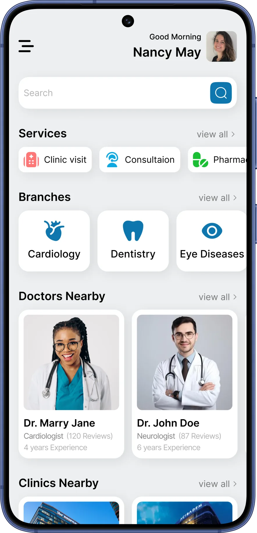
Search, specialties, the next visit and nearby doctors in one scroll. Location-based sections give quick access and reduce indecision.
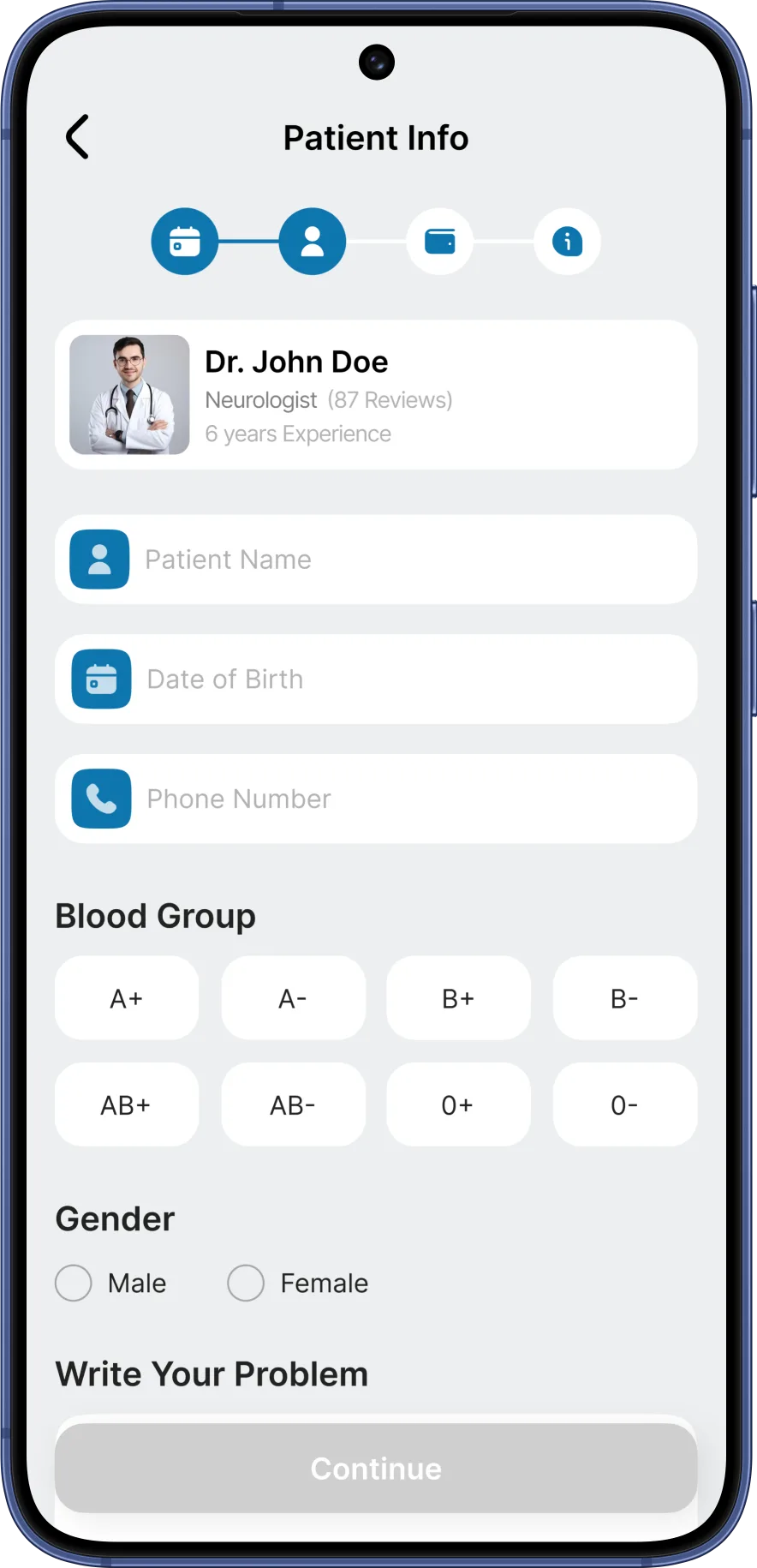
A large photo, rating, experience and patient count, next available slots and a fixed Book CTA — credibility first, action always visible.
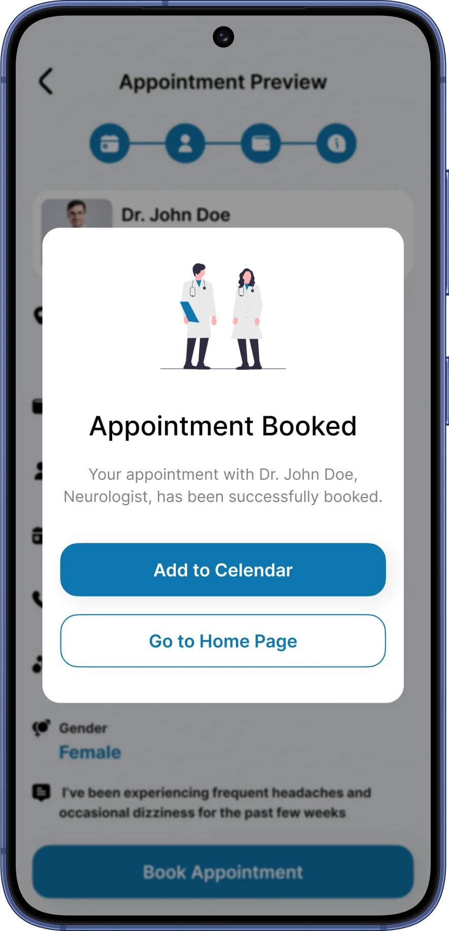
Consultation type, calendar and available times on one screen; the CTA carries the chosen slot so the decision is always visible.
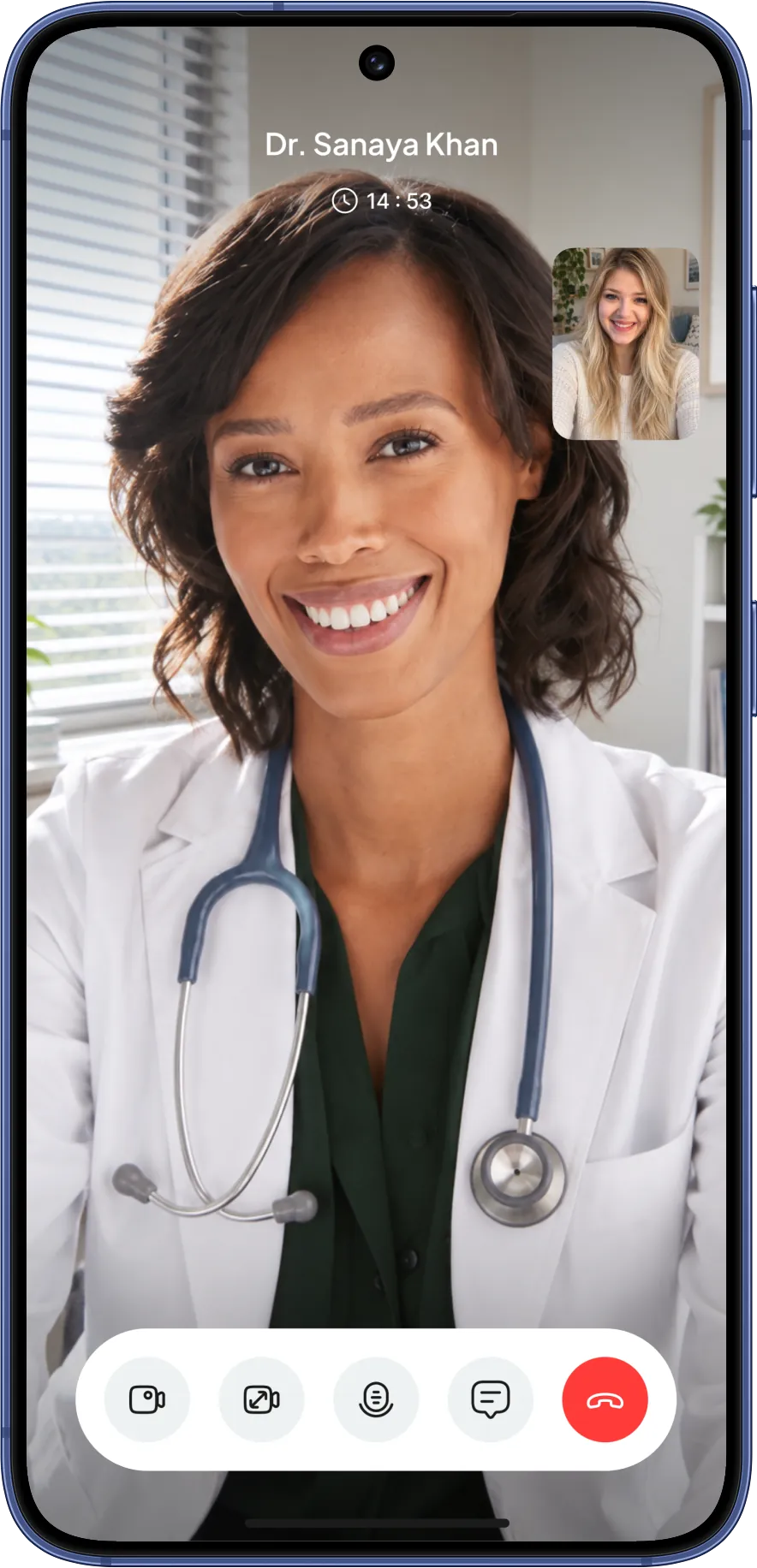
A full-screen, distraction-free call with a small self-view and the essential controls — the visit itself is part of the product.
10 more screens from the final design — tap any to enlarge.
Doctor credentials, reviews and a short booking path were prioritized to address reported trust and effort concerns.
Plain-language specialty cards were designed to help users choose a relevant doctor. Their effect on selection accuracy needs usability testing.
Reminders, the consultation and follow-up were designed as one journey. Repeat use and continuity of care require evaluation beyond the booking prototype.
