Your world. One happy cart.
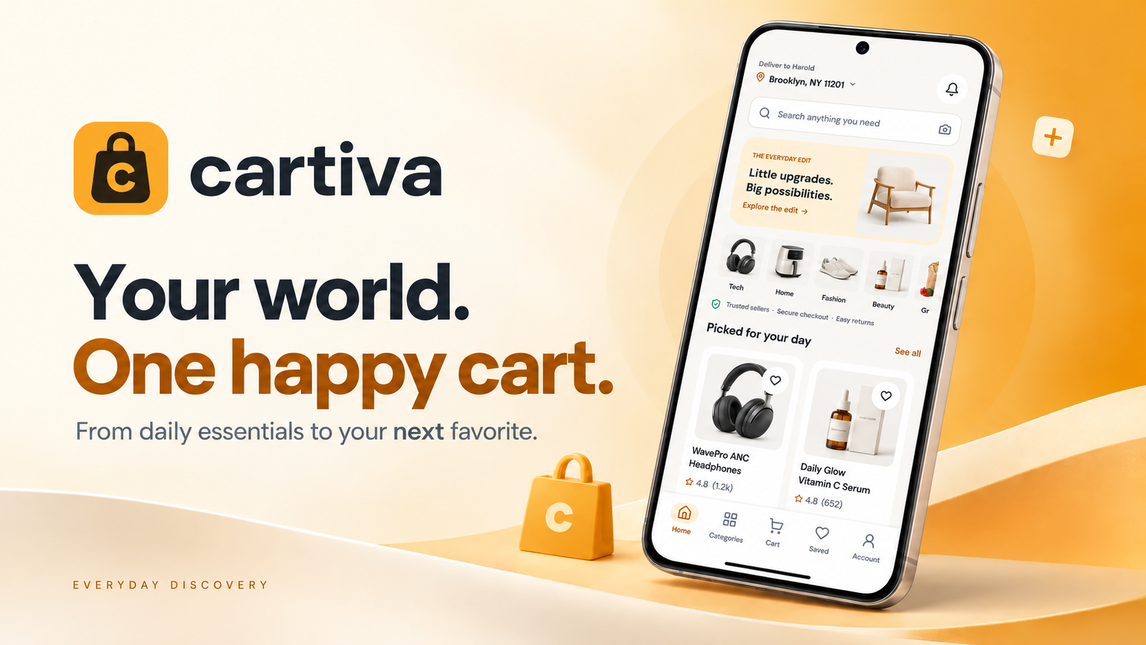
Cartiva is a mobile marketplace where products from many verified sellers feel like they come from one store. Users discover everyday essentials and small upgrades, compare sellers on price and delivery, check out once for multiple deliveries, and track, return or review every order from the same place.
Marketplace apps push the complexity of multiple sellers onto the shopper: duplicate listings, unclear delivery dates, checkouts that split into separate orders, and returns that require finding the right seller. The result is hesitation at exactly the moment people are ready to buy.
The shopper should never have to think about how many sellers are behind one cart.
Make discovery feel curated, not endless
Let shoppers compare sellers on one product without leaving the page
Collapse multi-seller checkout into a single, three-step flow
Make delivery, returns and support as clear as buying
Build a warm, trustworthy visual identity
A 72-person survey, ten in-depth interviews and marketplace reference walkthroughs.
Synthesizing findings into clear problems, user goals, flows, and the information architecture.
Wireframes to high-fidelity UI, built on a component system and refined through iteration.
Prototype flows and interface specifications, with validation priorities identified for the next stage.
Urban shoppers aged 20–40 buying everyday essentials and small upgrades on their phone several times a month.
Value-driven shoppers who compare prices and delivery times before committing, and rely on reviews.
Method Online survey · 72 respondents, 10 in-depth interviews, 4 competitor teardowns
| Task / dimension | Amazon | Walmart | Cartiva |
|---|---|---|---|
| Compare sellers | Other seller offers on product listings | Other seller offers on product listings | Dedicated compare-sellers panel |
| Multi-seller checkout | Shared checkout; fulfillment can differ | Shared checkout and payment; fulfillment can differ | Single checkout with seller-level delivery details |
| Delivery information | Dates and charges vary by offer and location | Dates and charges vary by seller and location | Estimated date and fee on product cards |
| Returns | Item and seller eligibility applies | Online or in-store; eligibility varies | Guided per-item return flow |
| Design focus | Broad retail marketplace | Retail and marketplace shopping | Discovery, seller clarity and post-purchase support |
Reference comparison updated September 2026. Rows describe task coverage and design focus, not a usability ranking. Availability may vary by plan, region and product version; the final column describes this case study’s design. This case study uses a US shopping context.
Home leads with a small editorial edit and a handful of relevant picks instead of an infinite grid — discovery feels like a store, not a warehouse.
One product, all verified offers: seller rating, sales volume, price and delivery date side by side, with the best offer pre-selected.
Delivery, payment and review in three steps; items from different sellers are grouped with their own dates but paid once.
Track, return and review live inside the order — guided returns with reason, condition and photos, and a help screen that already knows the order.
survey respondents · ages 20–45
Reported delivery uncertainty led to showing the estimated date and fee on product cards. This is a design response to the survey, rather than a measured increase in purchase intent.
Duplicate listings make comparing sellers exhausting
Delivery dates and fees appear only at checkout
Multi-seller carts turn into confusing separate orders
Returns and support feel like a maze

Harold buys most things on the phone — headphones, skincare, small furniture — usually in short bursts between meetings. He's happy to pay a little more for a seller he trusts and a delivery date he can plan around, and he has abandoned carts when neither was clear.
| Stage 01Discover Home & search | Stage 02Evaluate Product & sellers | Stage 03Decide Cart | Stage 04Buy Checkout | Stage 05After Track, return, review | |
|---|---|---|---|---|---|
| Actions | Browses the daily edit, searches, refines by rating and delivery | Reads reviews, compares three sellers on one screen | Adjusts quantities, sees free shipping unlocked | Confirms address, card and two deliveries in three steps | Tracks package, requests a return, leaves a review |
| Thoughts | "This feels curated." | "TechHaven is cheaper and arrives Friday — easy." | "Both packages ship free, nice." | "One payment, two deliveries, done." | "Returning was easier than I expected." |
| Emotion | Curious | Informed | Confident | Relieved | Trusting |
| Opportunity | Small editorial edit + relevant picks | Compare-sellers panel with best offer preselected | Show free-shipping status in the cart | Group items per delivery, pay once | Order-aware help and guided returns |
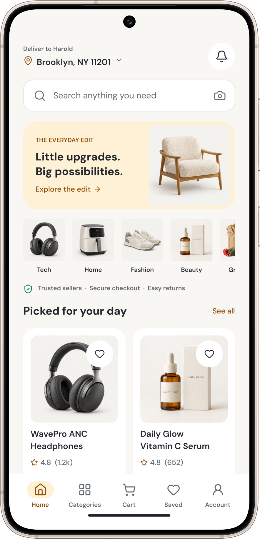
A short editorial edit, category chips and a few picks for the day. Delivery location sits at the top because it drives every price and date below.
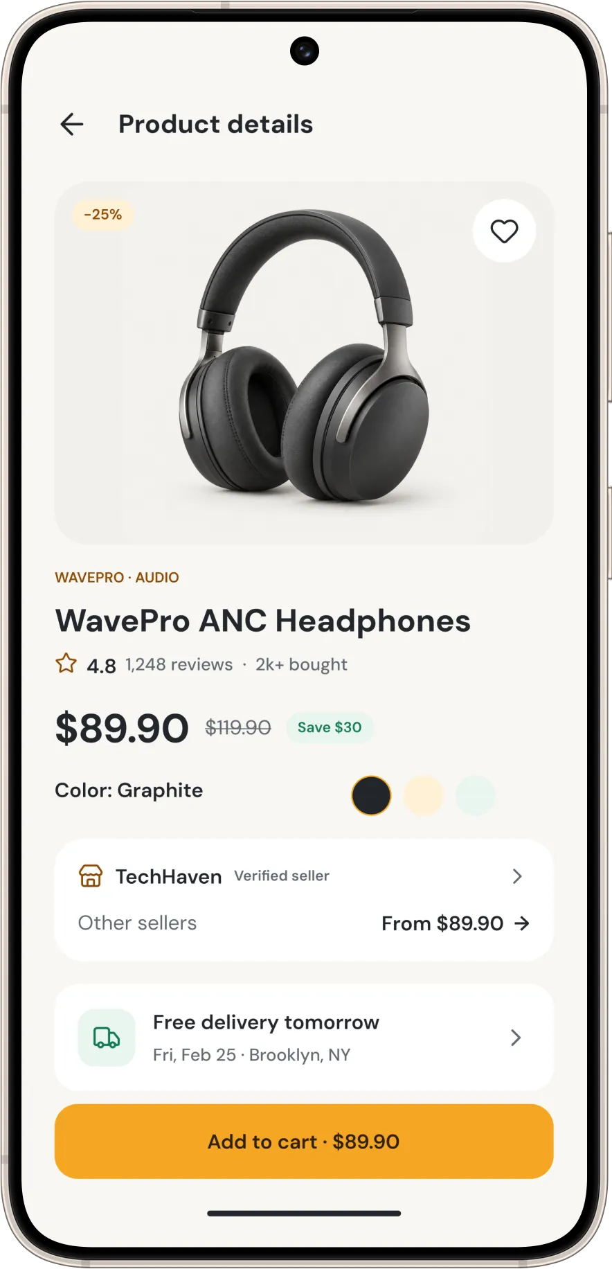
Price, savings, colour, seller and delivery date in one scroll — with 'Other sellers' surfaced right under the chosen one.
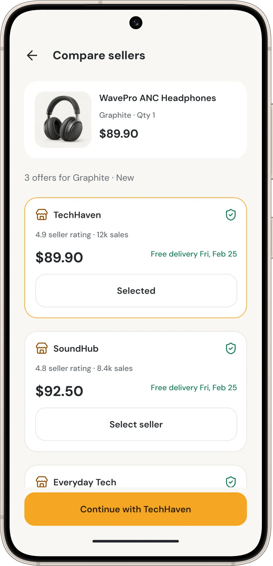
All verified offers for the same item, side by side: rating, sales, price, delivery. The best offer is preselected but never hidden.
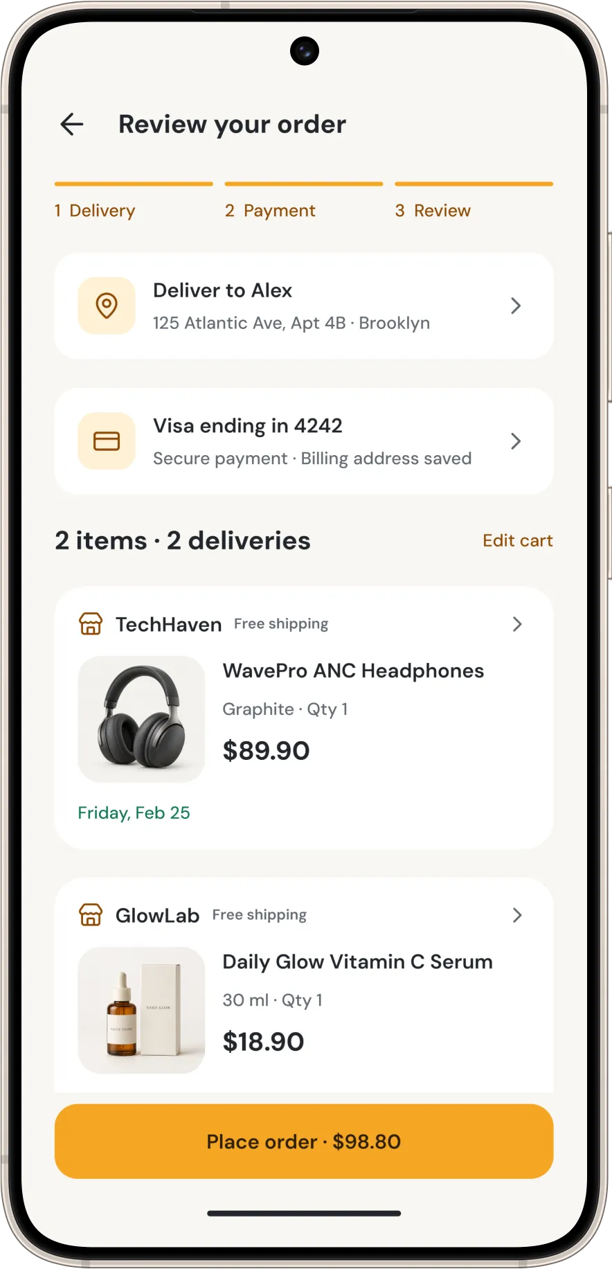
Address, card and both deliveries with their own dates, then a single Place order. Nothing about the multiple sellers leaks into the payment.
15 more screens from the final design — tap any to enlarge.
Delivery date and fee on the card, and free-shipping status in the cart, address reported uncertainty before checkout. Their effect on conversion requires controlled evaluation.
A dedicated compare-sellers panel replaced duplicate listings and made the marketplace feel like one store.
Tracking, returns and order-aware support extend the design beyond checkout. The proposed flows address trust concerns reported in the research; their effect needs task-based validation.
