Turning a sprawling course catalog into a path people can finish.
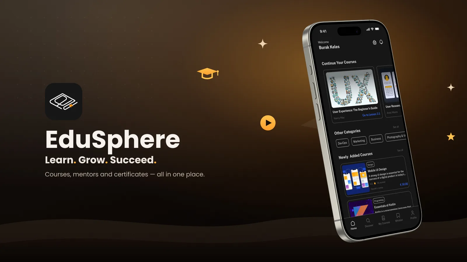
EduSphere is a mobile learning platform designed to make knowledge accessible to everyone. Users explore categories, enroll in courses, and track their progress — with an intuitive interface, personalized recommendations and a light layer of competition (quizzes, races and leagues) that supports continuous learning.
Learners struggle to discover courses that match their goals, lack a structured path, and get lost in cluttered interfaces that make progress hard to track.
People don't leave because they lost interest — they leave because they lost their place.
Simplify course discovery with personalized recommendations
Improve engagement with structured course navigation
Offer transparent progress tracking for learners
Enhance accessibility with a modern, intuitive UI
A 50-person survey focused on discovery, progress and learning motivation.
Synthesizing findings into clear problems, user goals, flows, and the information architecture.
Wireframes to high-fidelity UI, built on a component system and refined through iteration.
Prototype flows and interface specifications, with validation priorities identified for the next stage.
Young professionals (18–35) upskilling fast in tech, design, and business.
Students and lifelong learners seeking affordable, structured online courses.
Method Online survey · 50 respondents
| Task / dimension | Coursera | Udemy | EduSphere |
|---|---|---|---|
| Course discovery | Course and program catalog | Course marketplace and search | Interest-led recommendations |
| Progress tracking | Course and program progress | Course and lecture progress | Progress, milestones and certificates |
| Payment model | Individual purchases and subscriptions | Course purchases and Personal Plan subscription | Proposed enrollment and plan choices |
| Learning continuity | Course and program pathways | Course curriculum and lesson continuation | Continue learning prioritized on Home |
| Mobile access | Mobile app and web | Mobile app and web | Mobile learning interface |
Reference comparison updated September 2026. Rows describe task coverage and design focus, not a usability ranking. Availability may vary by plan, region and product version; the final column describes this case study’s design.
Home opens on streak, XP and coins, then 'Continue learning' — the next lesson is always one tap away.
Interests and a daily goal (5 to 60 minutes) shape recommendations from the very first session.
Short quizzes, 1v1 races and weekly leagues turn revision into a game without touching the course content itself.
XP and coins convert into real discounts on the next course, and every completion ends with a shareable certificate.
survey respondents · ages 18–35
The survey indicated interest in progress tracking and daily goals. These findings informed onboarding and the learning dashboard; repeat-session behavior requires longitudinal prototype or product testing.
Difficulty discovering the right courses
No structured learning path
Weak progress-tracking systems
Overloaded, confusing UI in other apps

Alex is a junior UX designer who wants to quickly improve his skills and stay current. He has tried different e-learning apps but often lost motivation to cluttered interfaces and unstructured courses. He values a clear roadmap and progress tracking.
| Stage 01Start Onboarding | Stage 02Choose Explore & enroll | Stage 03Learn Lessons & quizzes | Stage 04Compete Arena & leagues | Stage 05Achieve Rewards & certificate | |
|---|---|---|---|---|---|
| Actions | Picks interests and a 15-minute daily goal | Browses featured courses, enrols in UI/UX Foundations | Watches a lesson, takes the knowledge check | Enters the Design Sprint, races a rival | Redeems coins for a discount, downloads certificate |
| Thoughts | "Small steps — I can do 15 minutes." | "4.9 and 24 lessons. Let's go." | "90% — I actually got that." | "900 to 800! One more?" | "I finished something." |
| Emotion | Hopeful | Decided | Engaged | Energised | Proud |
| Opportunity | Habit before content | Rating, lessons and price on one card | Instant feedback + XP after every quiz | Short races, clear rules | Turn coins into the next course |
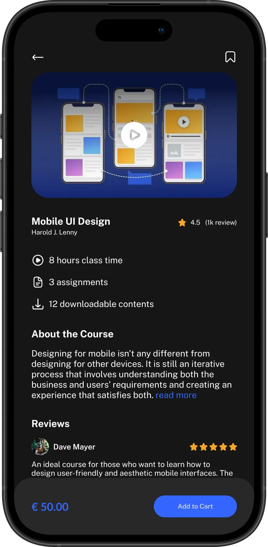
Streak, XP and coins on top, then Continue learning and today's challenge — continuity first, discovery second.
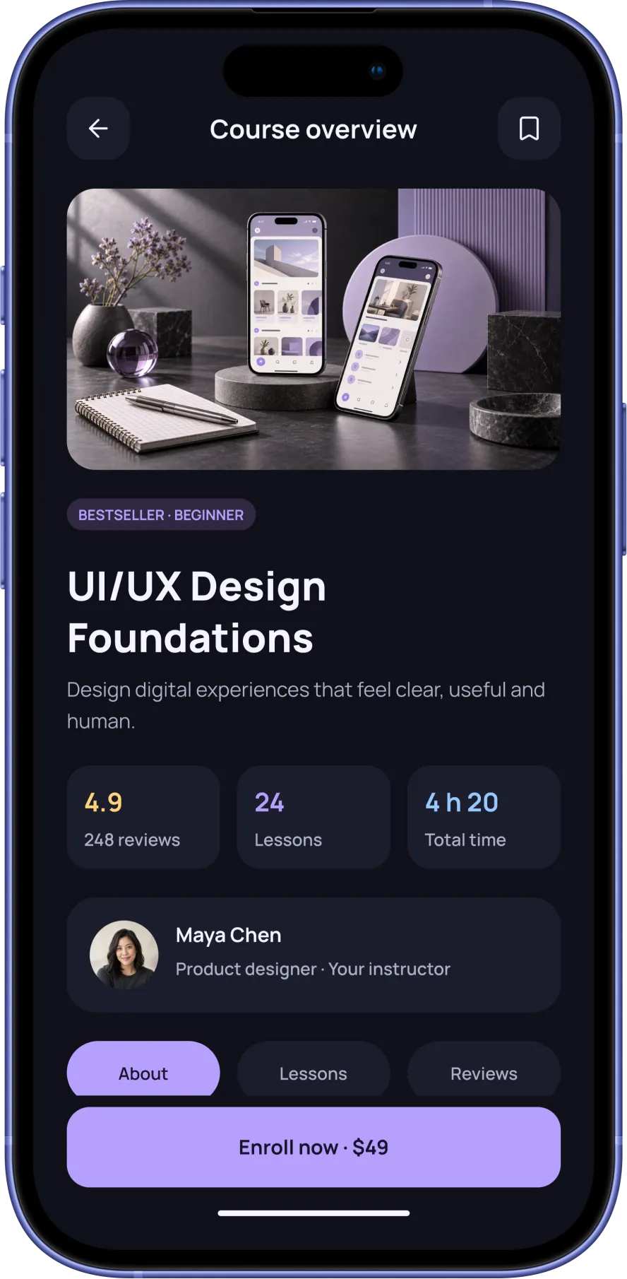
Rating, lessons, duration and instructor at a glance; tabs for About, Lessons and Reviews, with a fixed Enroll CTA carrying the price.
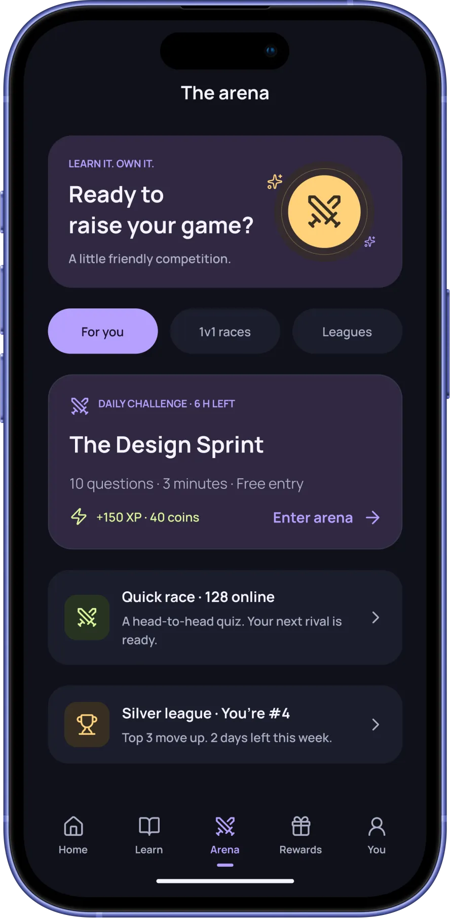
Daily challenges, 1v1 races and leagues in one hub — competition lives next to learning, not inside it.
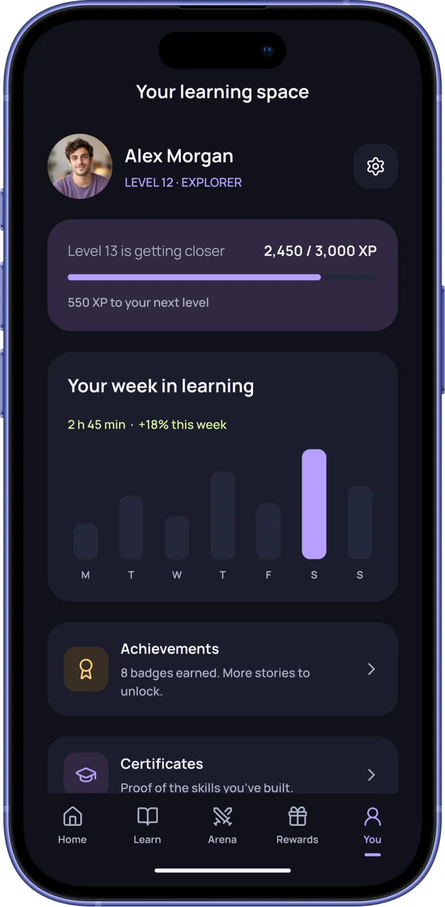
Level progress, weekly learning time, achievements and certificates in one profile — the proof of progress learners asked for.
19 more screens from the final design — tap any to enlarge.
The next validation step is task-based testing of onboarding, enrollment and lesson continuation before engineering hand-off.
Putting 'Continue learning' above new courses gives the next lesson priority. The intended effect on course completion should be measured after validation.
Competition is optional and separate from the core learning path, reflecting mixed survey interest. Its effect on motivation and distraction requires testing.
