Return a bottle, get your deposit back — without the friction.
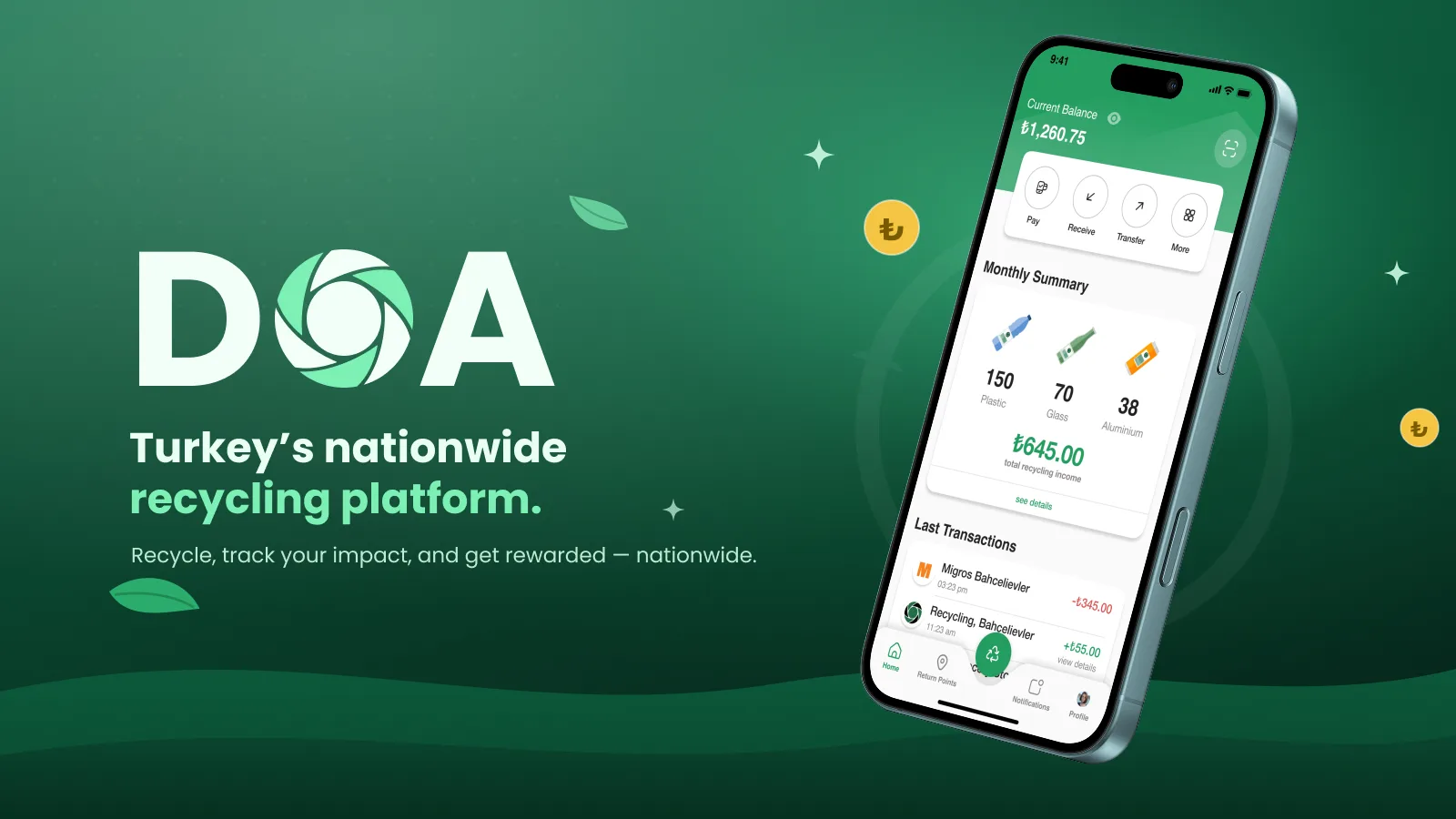
DOA (Depozitosu Olan Ambalajlar) is Turkey's nationwide recycling platform that lets citizens return beverage containers and get their deposit back. It integrates QR scanning, return-machine (RVM) locations, e-wallet tracking, and a reward system — making recycling effortless for everyone.
Recycling rates in Turkey are low due to limited awareness, complex processes, and few incentives. People often throw recyclable containers away because returning them isn't convenient or rewarding.
People recycle when it's easier to return a bottle than to throw it away.
Let every citizen return containers easily via QR codes and machines
Increase recycling participation across all ages
Ensure accessibility and simplicity for a diverse population
A 40-person survey, six in-depth interviews and four prototype tests.
Synthesizing findings into clear problems, user goals, flows, and the information architecture.
Wireframes to high-fidelity UI, built on a component system and refined through iteration.
Prototype testing and interface specifications for the consumer and operational flows.
18–65 general citizens who buy beverages and use the system frequently.
Students, families, and elderly users seeking convenience and financial rewards.
Method 40-person survey, 6 in-depth interviews, 4 prototype tests
| Task / dimension | myTOMRA | Return and Earn (NSW) | DOA |
|---|---|---|---|
| Find a return point | Return-point map | Return-point finder | Nearby-machine discovery |
| Identify a return | App barcode; scheme dependent | App barcode at supported return points | Proposed QR-linked return flow |
| Digital refunds | Digital payout; options vary by scheme | Digital refunds including PayPal; eligibility varies | Wallet balance and bank-transfer flow |
| Return history | Digital return activity | Digital refund tracking | Balance and return-history screens |
Reference comparison updated September 2026. Rows describe task coverage and design focus, not a usability ranking. Availability may vary by plan, region and product version; the final column describes this case study’s design. These are specific consumer services; their deposit schemes and payout arrangements differ from Türkiye’s system.
The home screen leads with the deposit balance and a monthly recycling summary — the reward is visible before anything else.
Nearby return points with distance and machine count, so a trip can be planned instead of guessed.
Deposits can stay in the e-wallet, be spent, or be transferred to a bank account in a couple of taps.
Total items, CO₂ saved and energy saved turn a chore into a visible contribution.
survey respondents · ages 18–65
The survey pointed to three priorities: explain deposit returns, help people locate machines, and make refunds clear. Full-word labels were selected to support a broad age range; age-group completion rates are not established by the figures shown here.
Citizens don't know where to return containers
Long queues or complicated refunds reduce motivation
No way to track refunds
Elderly users struggle with complex interfaces
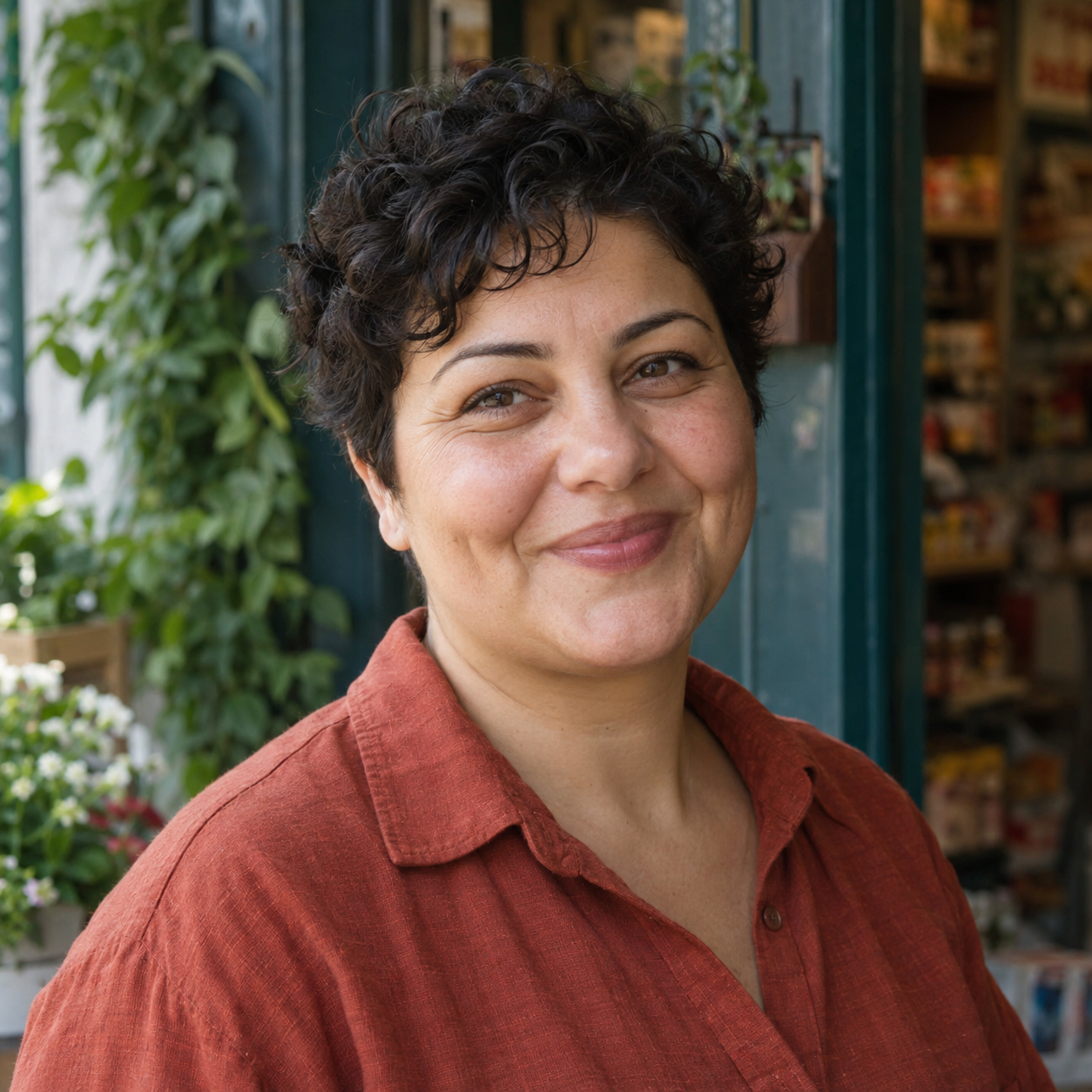
Ayşe is a 42-year-old shop owner who frequently buys bottled water and sodas for both her shop and her family. She cares about the environment but has little time, and wants a simple way to return containers and get her deposit back quickly.
| Stage 01Learn Awareness | Stage 02Find Return points | Stage 03Return QR scan at machine | Stage 04Collect Balance & refund | Stage 05Repeat History & impact | |
|---|---|---|---|---|---|
| Actions | Hears about deposits, installs the app | Opens the map, finds a machine near the shop | Scans the QR, feeds containers, gets confirmation | Sees the balance grow, transfers to bank | Checks monthly summary and CO₂ saved |
| Thoughts | "Is this worth it?" | "There's one 800 m away." | "That was quick." | "Real money, in my account." | "We've recycled 300 items this month." |
| Emotion | Sceptical | Curious | Satisfied | Rewarded | Proud |
| Opportunity | Plain-language onboarding | Distance and machine count on the map | Instant confirmation after scan | Bank transfer in two taps | Impact stats as motivation |
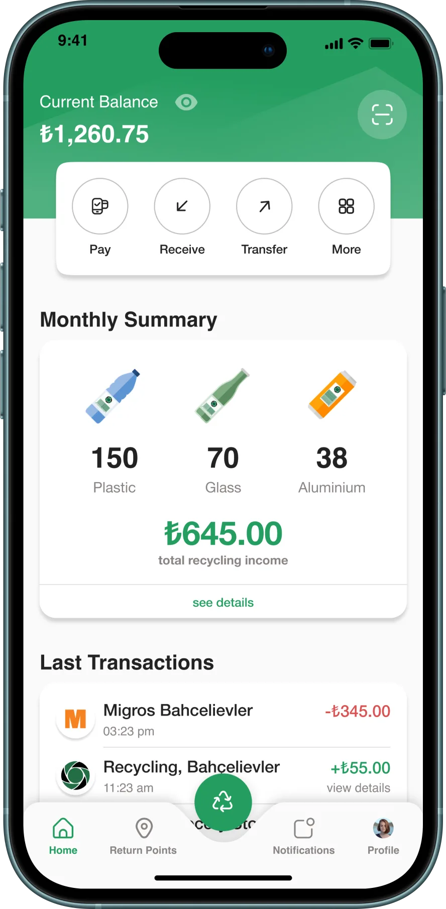
Current balance plus a monthly recycling summary by material type. Quick actions (Pay, Receive, Transfer) and a recent-transactions list build transparency and trust.
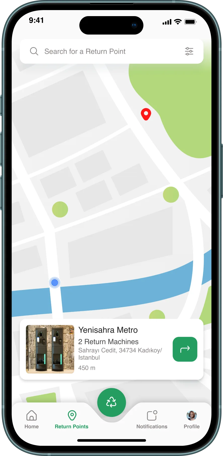
An interactive map with clear markers shows nearby machines and distances. A detail card gives exact location and machine count, so trips are easy to plan.
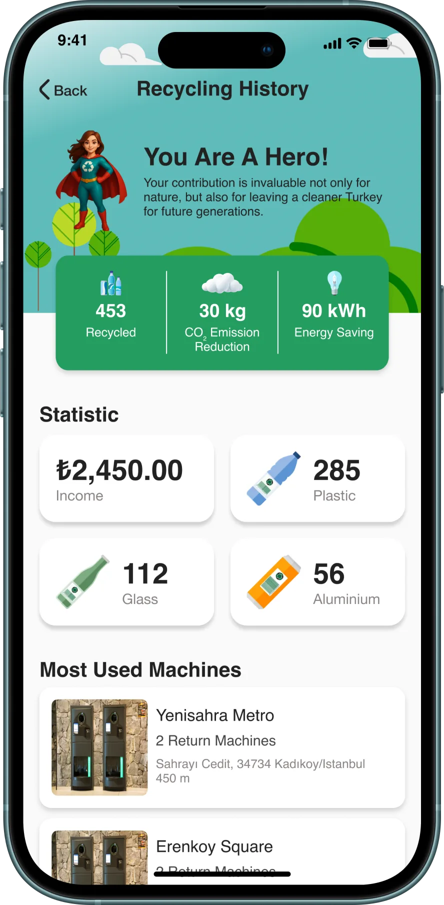
Celebrates impact with a hero message — total recycled items, CO₂ reduction, energy saved — plus per-material stats and a most-used-machines list to reinforce the habit.
6 more screens from the final design — tap any to enlarge.
Age-friendly defaults and a transparent balance screen address the need to understand the return process and refund status. Their effect on adoption requires follow-up measurement.
Full-word labels on critical actions make the intended action explicit across the interface. Accessibility should be evaluated with participants across age and ability groups.
Monthly summaries and environmental-impact estimates were designed to encourage repeat returns. Habit formation and the assumptions behind impact estimates require separate validation.
