A full redesign to earn the trust of an international audience.
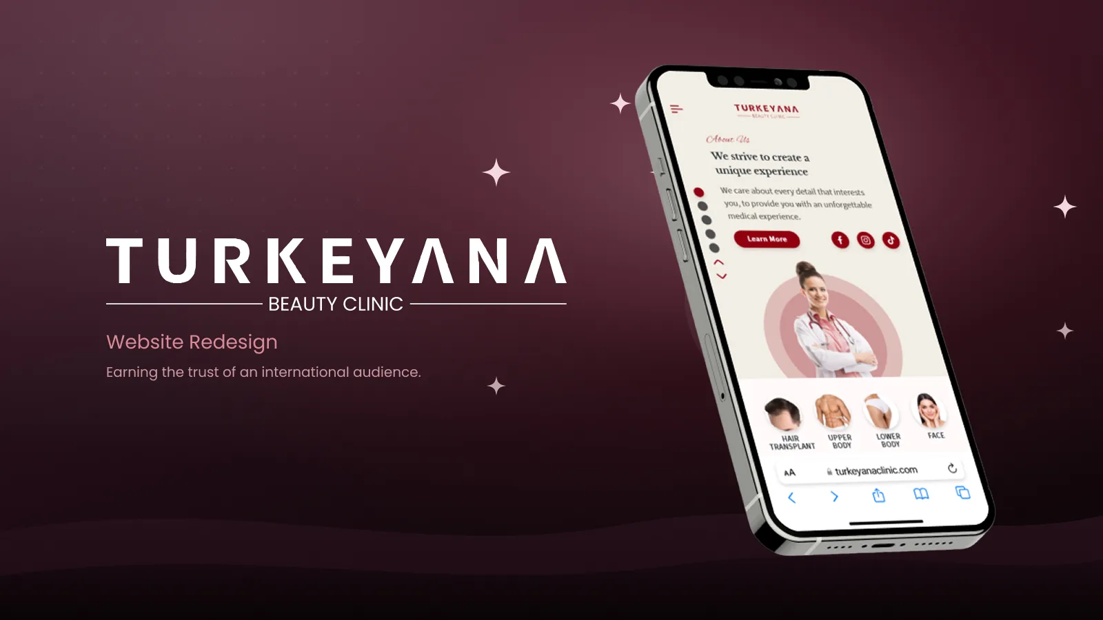
Turkeyana Clinic serves patients from around the world. Its site looked dated and didn't turn international visitors into booked consultations. The redesign rebuilt the visual identity, the operation pages and the consultation funnel as a responsive, multilingual-ready system.
The old site undersold the clinic's quality and made the consultation request hard to find, especially for non-Turkish-speaking visitors.
For a medical decision made from another country, trust is the entire interface.
Modernize the visual identity
Clarify the consultation funnel
Build a responsive, multilingual-ready system
Site analytics, heatmaps, session recordings and five past-patient interviews.
Synthesizing findings into clear problems, user goals, flows, and the information architecture.
Wireframes to high-fidelity UI, built on a component system and refined through iteration.
Prototype flows and interface specifications, with validation priorities identified for the next stage.
International patients (25–55) researching hair transplant and aesthetic procedures from abroad, mostly on mobile.
Local patients comparing clinics, and partner agencies referring patients.
Method Analytics review, heatmaps and session recordings, 5 remote interviews with past patients
| Task / dimension | Anonymized clinic reference A | Anonymized clinic reference B | Turkeyana Redesign |
|---|---|---|---|
| Procedure information | Short-form information in project notes | Long-form information in project notes | Stages, results and FAQ structure |
| Consultation entry | Form-based entry in project notes | Messaging-based entry in project notes | Guided consultation request |
| Mobile layout | Responsive behavior not documented | Responsive behavior not documented | Mobile-first responsive layout |
| Language coverage | Language coverage not documented | Language coverage not documented | Multilingual-ready design system |
| Design focus | Clinic reference | Clinic reference | Procedure information and consultation clarity |
Anonymized references from the project notes. Identities, reviewed versions and review dates are not documented here, so these observations are not presented as a current competitor audit.
Every procedure gets a structured page — what it is, stages, before/after and concerns — instead of a paragraph and a phone number.
A simple calculator on hair-transplant pages gives visitors a concrete estimate and a reason to start a consultation.
A four-step request — concern, details, photos, contact — replaces a long form and works on a phone.
Blogs, doctor profiles and results give the site the credibility of a medical institution rather than a marketing page.
of site analytics (all sessions) · plus 5 past-patient interviews for the qualitative findings
The mobile share, interest in before-and-after content and consultation-form abandonment informed a mobile-first layout and clearer procedure pages. These descriptive figures do not establish a causal increase in consultation requests.
Dated visuals undermine credibility
Consultation request is hard to find
Procedure information is thin and unstructured
Content isn't built for non-Turkish visitors
Daniel has been considering a hair transplant for two years and is now comparing clinics in İstanbul. He wants clear information on the procedure, honest results and an easy way to get a professional opinion before booking flights.
| Stage 01Land Homepage | Stage 02Explore Operations | Stage 03Understand Operation details | Stage 04Trust Blogs & results | Stage 05Act Consultation | |
|---|---|---|---|---|---|
| Actions | Arrives from search on mobile, scans the hero | Browses operations by area, opens hair transplant | Reads stages, uses the graft calculator | Reads a blog on recovery, looks at results | Completes the 4-step consultation request |
| Thoughts | "This looks like a real clinic." | "Everything is organised by concern." | "About 3,000 grafts — okay." | "They explain the risks too." | "That took two minutes." |
| Emotion | Cautious | Oriented | Informed | Reassured | Confident |
| Opportunity | Calm hero + clear CTA | Operations grouped by body area | Stages + calculator on the page | Editorial content and real results | Short, mobile-first consultation flow |
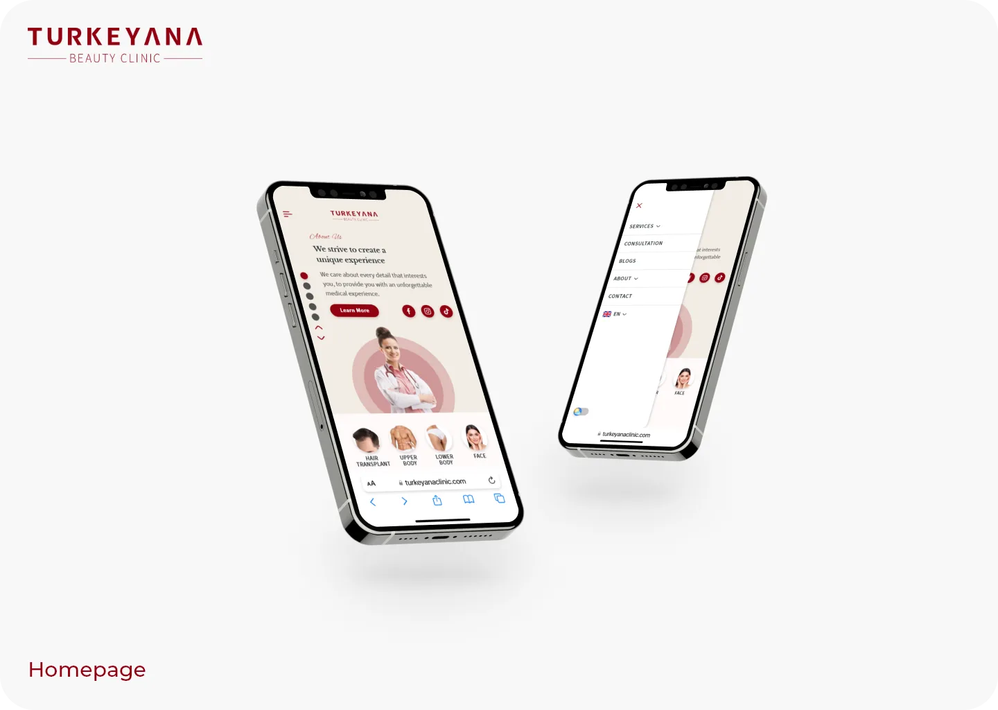
A calm hero, the clinic's promise and direct paths into operations — designed for a first visit on a phone.
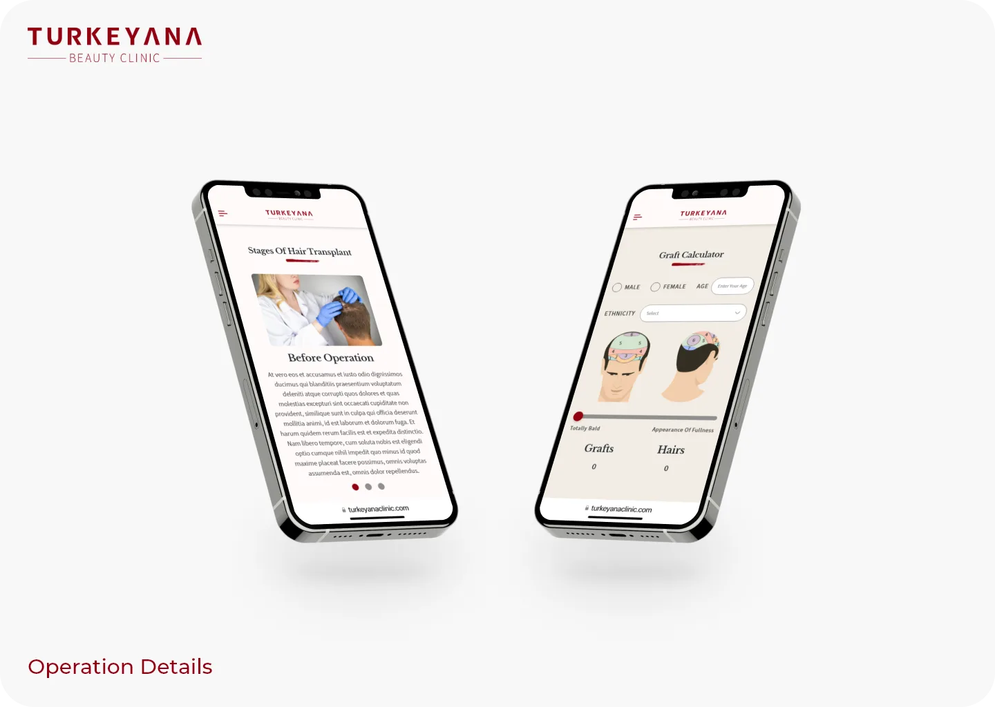
Stages of the procedure, before-operation guidance and the graft calculator on one page, so the visitor leaves with an estimate.
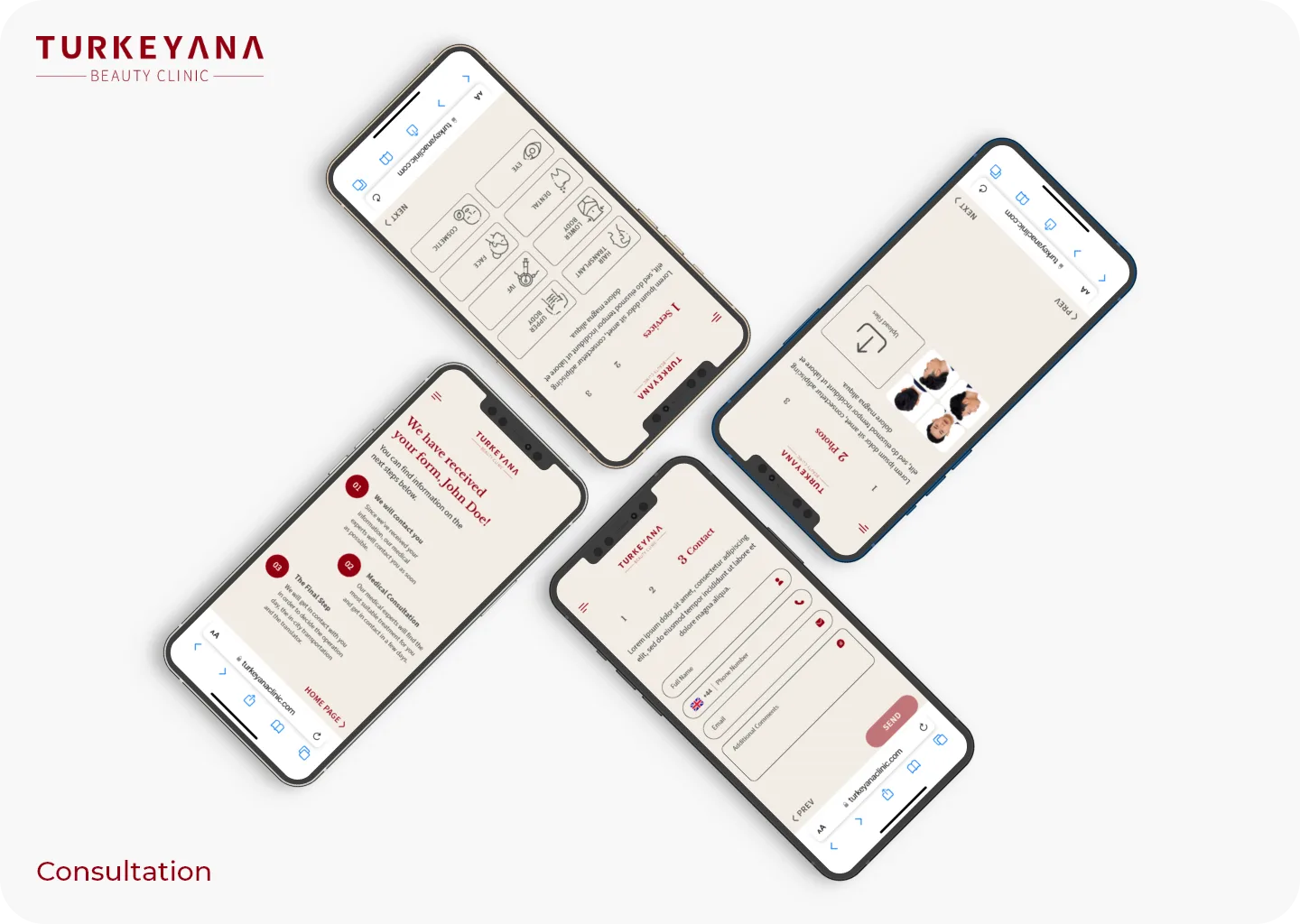
A guided four-step request — concern, details, photos, contact — replacing the buried form on the old site.
2 more screens from the final design — tap any to enlarge.
The redesign prioritizes credible results, clear procedure information and accessible consultation entry points. Their effect on qualified inquiries requires post-launch measurement.
Turning procedures into structured pages with stages and FAQs answered the questions visitors had been asking on WhatsApp.
Building mobile-first matched how international patients actually arrive, and simplified every decision after.
